Bigelow Tea
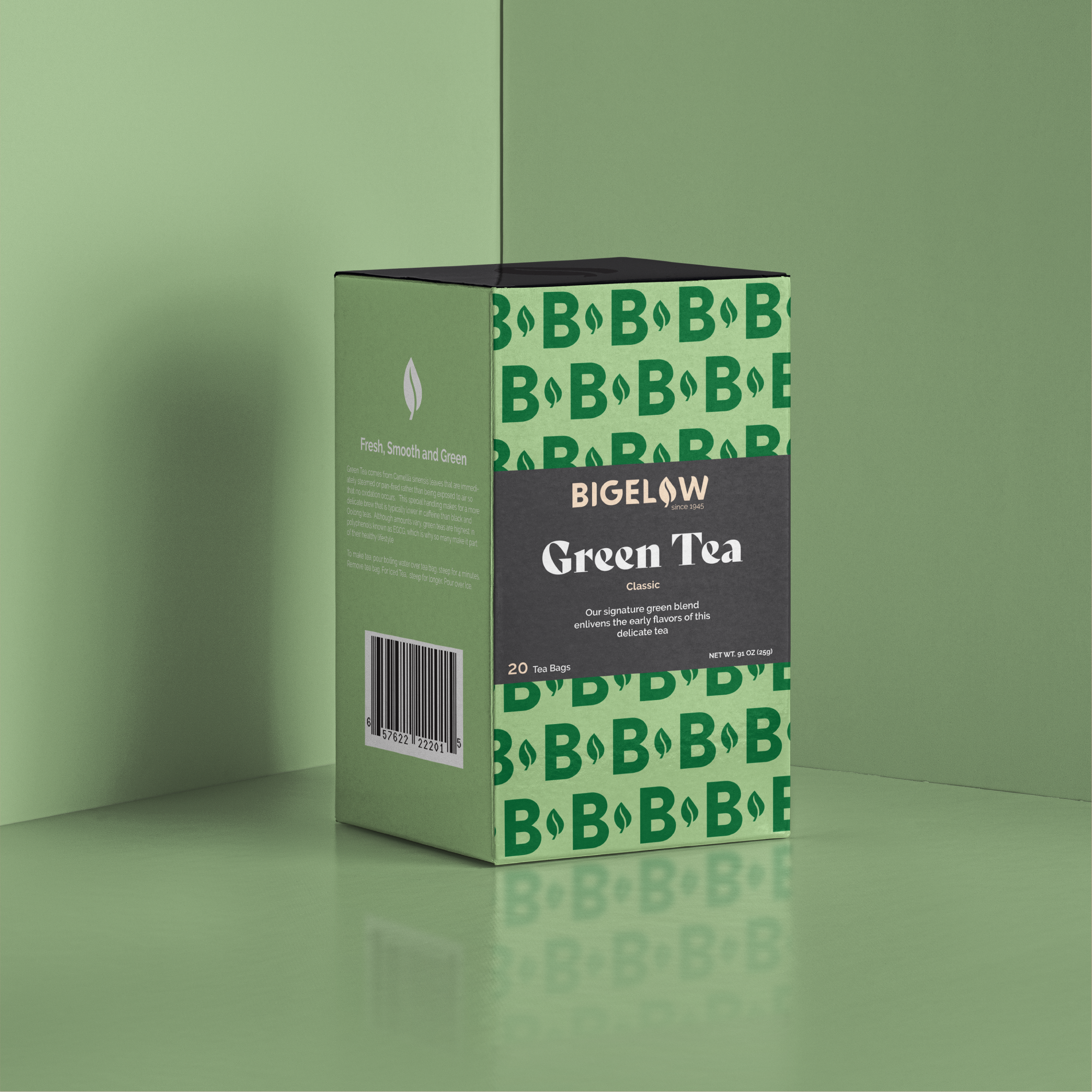
Founded in 1945, Bigelow Tea is one of the most recognizable tea brands, best known for its “Constant Comment” flavor. For this project, I rebranded Bigelow’s logo and packaging, simplifying its overly complex design into a more modern and refreshing look while preserving brand recognition.
DELIVERABLES - Rebranding, Package Design
Initial Logo Comps
Brand Development
I began with extensive research on company rebrands and competitor logos, aiming for a minimal yet timeless update. Keeping Bigelow’s heritage in mind, I refined the logo by integrating the original leaf icon into the “O”, creating a sleek yet familiar aesthetic. The color palette remained true to the brand but was refreshed for a more contemporary feel.
The packaging redesign followed the same approach, featuring a custom “B” and leaf pattern to enhance brand identity across multiple flavors.
Design Process
Initial concepts included a bold, unique design for “Constant Comment,” but user testing revealed it disrupted brand consistency. Instead, I opted for a cohesive packaging system across all flavors, integrating the logo pattern on the front for a more unified look. The final design successfully modernizes the brand while preserving its legacy.
Initial Design Comps


